Last night I took a walk around campus to see the Advanced Digital Art class's final projects. They had to make animations or videos, and design them with the intention of projecting the final product onto a building. There was a wide range of work, ranging from stop-motion, simple animation, and videos of live interviews. Most of them also featured sound, making it easy to find where another projection was being held.
I appreciated the wide variety of techniques that I saw in each of the projects. The stop-motion project was a lot of fun, and I thought the idea was well-executed. Some projects I thought were also well-suited to the places that they were projected. One project of a baby on a swing seemed to connect the ropes of the swing to the top of the building it was being projected on, making it look like it was a normal part of the building. There were other projects that were deeply personal or emotional. Although these projects took different approaches from hand-drawn elements or animation, I thought it was interesting having such emotional content be projected onto a campus building for anyone to see.
My favorite project was one that appeared simple, but had a great amount of thought put into where it was to be projected. The project was a short animation of a lizard that crawled around a column of the library wall. The animation had been made and set up to look like the lizard was actually going around and around the column. It was short and simple, but very cool.
Thursday, May 8, 2014
Monday, April 14, 2014
Artist post: Meomi web design
Meomi is Vicki Wong and Michael Murphy. They are illustrators based in Vancouver, and have created children's books and TV shows. Meomi was also in charge of designing the 2010 Vancouver Olympics and Paralympics mascots.
Meomi's web designs also showcase their whimsical and cutesy style. I was surprised to find out that I had been using their designs before I actually knew who they were- they have designed the "Teahouse Fox" and several other templates that are available for our SMCM Gmail accounts.
Meomi's website very clearly shows viewers their illustration style and the kind of work the team excels at producing. I think the website also balances out it's simple layout by adding a lot of illustrative detail and animation. There are plenty of point-and-click icons that viewers can entertain themselves with, including walking puppies, grazing turtles, and turnips that play tunes as they get watered. It's startlingly adorable, but their website design certainly shows the viewer what to expect from the Meomi team as soon as they visit it.
 |
| Quatchi, Miga, Sumi, and Mukmuk. So adorable. (From Google Images) |
 |
| "Teahouse Fox" from Google Images. My favorite of their e-mail templates. |
 |
| Meomi, in all their illustrated glory. |
Wednesday, April 2, 2014
"Get Lost" Assignment
So, I didn't really "get lost" because I'm so directionally challenged that I would probably end up getting lost for good. But I did walk along a pretty trail in Historic.


Tuesday, April 1, 2014
"Identify Yourself" article and Jon Rafman
Krystal South's article on humanity's ties to the internet was interesting, albeit formatted in a way that made scrolling through the website a bit disorienting. One point she made that especially stuck out to me was the impact of constant access to information (be it through a smart phone, a laptop, or places that provide free Wi-Fi). Having the ability to have access to the internet at any time has definitely made it so that the tolerance for a lack of such information is incredibly low. Even the slight delay of a browser window opening is enough to get me twitchy and irritated. Admitting that to myself was a bit sad, especially since I also just admitted that I may as well fall over and die if my iPhone were to be taken away from me. (No more Google maps. I shudder at the thought.)
This cynicism was balanced out by the fact that the internet has definitely come very far from its initial development- it's gone beyond the initial goal of creating a new form of communication that would provide immense amounts of information in almost no time at all. In addition to communication, the internet is a way to create art and form identities for ourselves in completely new ways. It's therefore important to continue developing the technology we use, and discover new ways to use it. The closing message certainly has its significance, and I definitely think that there are new ways of creating messages or artwork that have yet to be discovered. But I also think there are those people (myself often included) who will use that same amazing technology to fool around on Facebook or look at pictures of fuzzy animals.
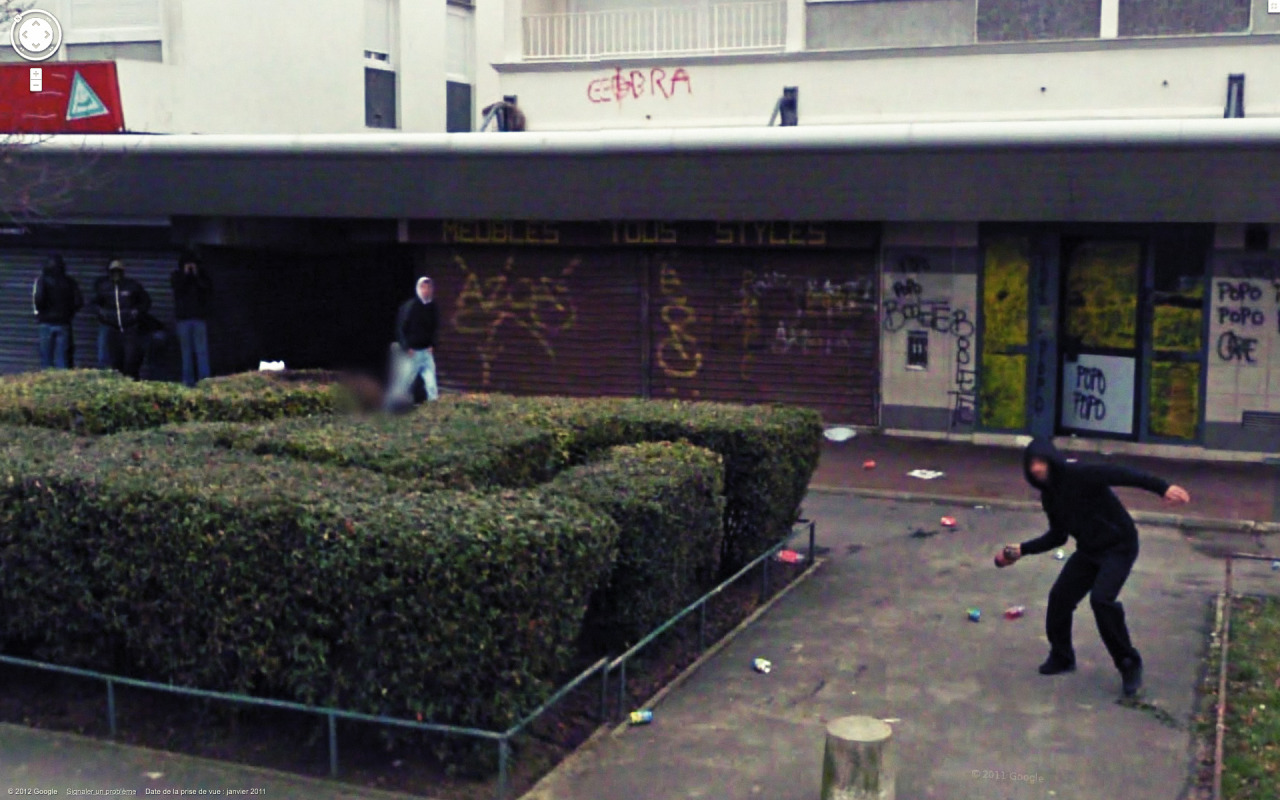
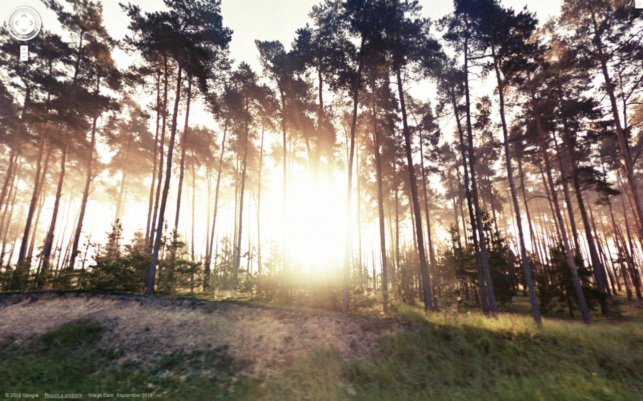
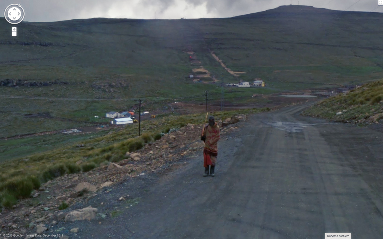
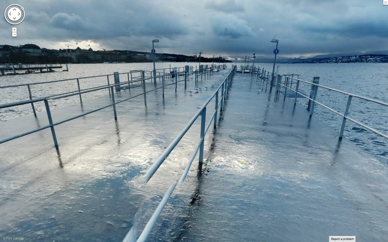
On another note, South's article featured photographs from of the artist Jon Rafman, which he collects through the use of Google Street View. I felt that his images captured the idea of the internet as a tool for providing information and a way to communicate by showing interesting scenes from what seems to be all over the world, and collected by use of the internet. Some images were a bit strange, some are really beautiful, and some of them are slightly sinister. It's an interesting way to capture all aspects of the web.
This cynicism was balanced out by the fact that the internet has definitely come very far from its initial development- it's gone beyond the initial goal of creating a new form of communication that would provide immense amounts of information in almost no time at all. In addition to communication, the internet is a way to create art and form identities for ourselves in completely new ways. It's therefore important to continue developing the technology we use, and discover new ways to use it. The closing message certainly has its significance, and I definitely think that there are new ways of creating messages or artwork that have yet to be discovered. But I also think there are those people (myself often included) who will use that same amazing technology to fool around on Facebook or look at pictures of fuzzy animals.
On another note, South's article featured photographs from of the artist Jon Rafman, which he collects through the use of Google Street View. I felt that his images captured the idea of the internet as a tool for providing information and a way to communicate by showing interesting scenes from what seems to be all over the world, and collected by use of the internet. Some images were a bit strange, some are really beautiful, and some of them are slightly sinister. It's an interesting way to capture all aspects of the web.
Wednesday, March 26, 2014
Project 2- Vector Drawing
My second project! The idea I had for this project changed quite a bit from my last progress post. I decided to play with size, and based the final image off of the scene in "My Neighbor Totoro", when the girls and Totoro are standing in the rain by the bus stop sign. Not sure how well that idea got across, but it ended up being pretty fun anyway. Edit from the last time this was posted- I decided to keep the messy edges that I had when I was working on this.
 |
| "My Neighbor Steve" |
Monday, March 24, 2014
Logo remix- Gundam Wing
Gundam Wing was one of my favorite shows as a kid because it featured guys in giant robots blowing things up. The premise was actually way more complicated than that, but the giant fighting robots were really all that mattered to me. Anyway, I thought it would be fun to remix its logo for this assignment. Here's the original:
I really wanted to feature a silhouette of Wing Zero (look it up), and the rest came together after that. I wanted to use a similar font, but have the text non-italicized to match the straight-on view of silhouette. I don't think it really loses the dramatic cheesiness of the original, but I guess if I did that then I wouldn't be properly representing the show.

| In all its 80s/90s glory |
I really wanted to feature a silhouette of Wing Zero (look it up), and the rest came together after that. I wanted to use a similar font, but have the text non-italicized to match the straight-on view of silhouette. I don't think it really loses the dramatic cheesiness of the original, but I guess if I did that then I wouldn't be properly representing the show.
Thursday, March 13, 2014
Portrait progress and AI tool post
My progress thus far on my portrait piece:
 It's eventually going to be more than Steve's giant nose- I think I'm going to have him standing on something that trails down the canvas (hence the huge white space). We'll see how the rest of it turns out!
There are a few tools in Illustrator that I have yet to use. One of them is the gradient tool, which allow you to control value scales within your work. It's pretty neat, but I've never used it much in Photoshop so I don't know if I'll end up doing much with it in Illustrator. Anyway, you can learn more about it here.
There are a few tools in Illustrator that I have yet to use. One of them is the gradient tool, which allow you to control value scales within your work. It's pretty neat, but I've never used it much in Photoshop so I don't know if I'll end up doing much with it in Illustrator. Anyway, you can learn more about it here.
Subscribe to:
Posts (Atom)