Last night I took a walk around campus to see the Advanced Digital Art class's final projects. They had to make animations or videos, and design them with the intention of projecting the final product onto a building. There was a wide range of work, ranging from stop-motion, simple animation, and videos of live interviews. Most of them also featured sound, making it easy to find where another projection was being held.
I appreciated the wide variety of techniques that I saw in each of the projects. The stop-motion project was a lot of fun, and I thought the idea was well-executed. Some projects I thought were also well-suited to the places that they were projected. One project of a baby on a swing seemed to connect the ropes of the swing to the top of the building it was being projected on, making it look like it was a normal part of the building. There were other projects that were deeply personal or emotional. Although these projects took different approaches from hand-drawn elements or animation, I thought it was interesting having such emotional content be projected onto a campus building for anyone to see.
My favorite project was one that appeared simple, but had a great amount of thought put into where it was to be projected. The project was a short animation of a lizard that crawled around a column of the library wall. The animation had been made and set up to look like the lizard was actually going around and around the column. It was short and simple, but very cool.
Thursday, May 8, 2014
Monday, April 14, 2014
Artist post: Meomi web design
Meomi is Vicki Wong and Michael Murphy. They are illustrators based in Vancouver, and have created children's books and TV shows. Meomi was also in charge of designing the 2010 Vancouver Olympics and Paralympics mascots.
Meomi's web designs also showcase their whimsical and cutesy style. I was surprised to find out that I had been using their designs before I actually knew who they were- they have designed the "Teahouse Fox" and several other templates that are available for our SMCM Gmail accounts.
Meomi's website very clearly shows viewers their illustration style and the kind of work the team excels at producing. I think the website also balances out it's simple layout by adding a lot of illustrative detail and animation. There are plenty of point-and-click icons that viewers can entertain themselves with, including walking puppies, grazing turtles, and turnips that play tunes as they get watered. It's startlingly adorable, but their website design certainly shows the viewer what to expect from the Meomi team as soon as they visit it.
 |
| Quatchi, Miga, Sumi, and Mukmuk. So adorable. (From Google Images) |
 |
| "Teahouse Fox" from Google Images. My favorite of their e-mail templates. |
 |
| Meomi, in all their illustrated glory. |
Wednesday, April 2, 2014
"Get Lost" Assignment
So, I didn't really "get lost" because I'm so directionally challenged that I would probably end up getting lost for good. But I did walk along a pretty trail in Historic.


Tuesday, April 1, 2014
"Identify Yourself" article and Jon Rafman
Krystal South's article on humanity's ties to the internet was interesting, albeit formatted in a way that made scrolling through the website a bit disorienting. One point she made that especially stuck out to me was the impact of constant access to information (be it through a smart phone, a laptop, or places that provide free Wi-Fi). Having the ability to have access to the internet at any time has definitely made it so that the tolerance for a lack of such information is incredibly low. Even the slight delay of a browser window opening is enough to get me twitchy and irritated. Admitting that to myself was a bit sad, especially since I also just admitted that I may as well fall over and die if my iPhone were to be taken away from me. (No more Google maps. I shudder at the thought.)
This cynicism was balanced out by the fact that the internet has definitely come very far from its initial development- it's gone beyond the initial goal of creating a new form of communication that would provide immense amounts of information in almost no time at all. In addition to communication, the internet is a way to create art and form identities for ourselves in completely new ways. It's therefore important to continue developing the technology we use, and discover new ways to use it. The closing message certainly has its significance, and I definitely think that there are new ways of creating messages or artwork that have yet to be discovered. But I also think there are those people (myself often included) who will use that same amazing technology to fool around on Facebook or look at pictures of fuzzy animals.
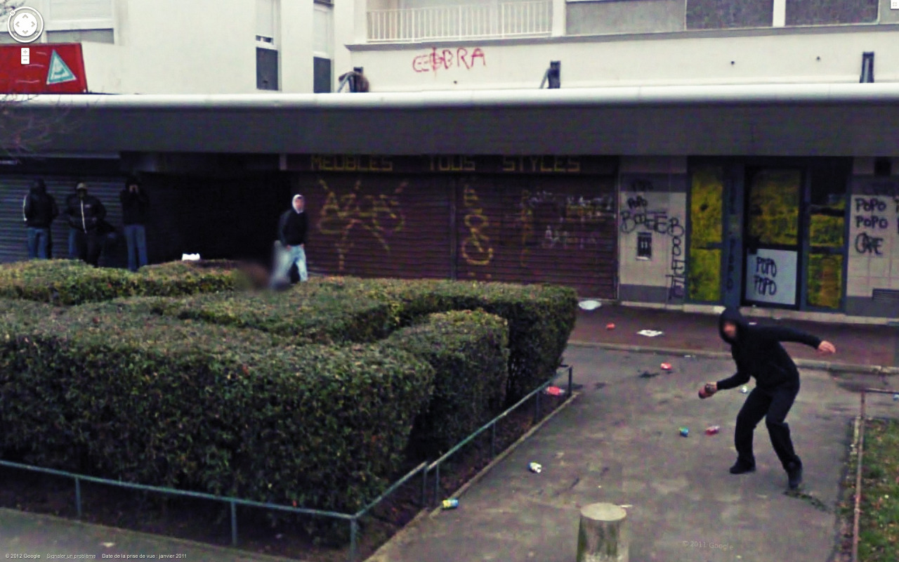
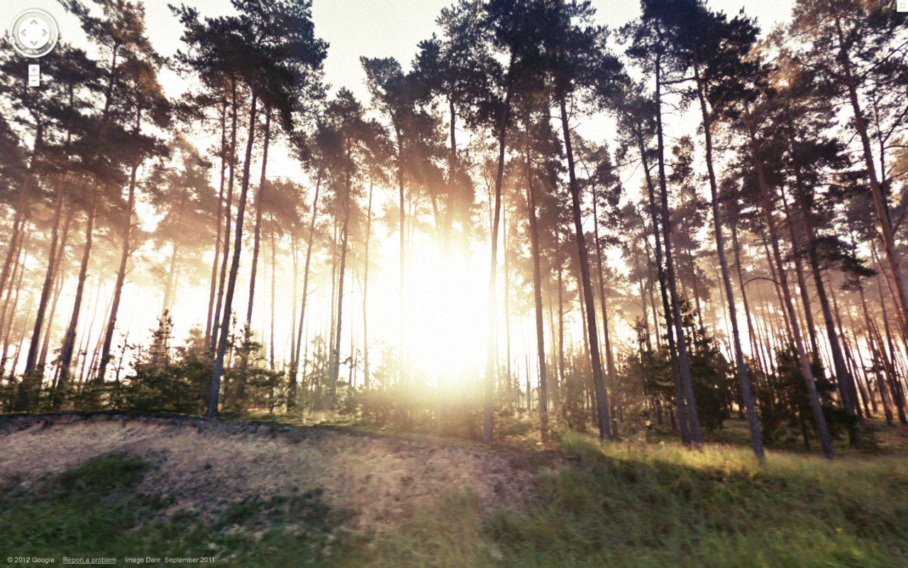
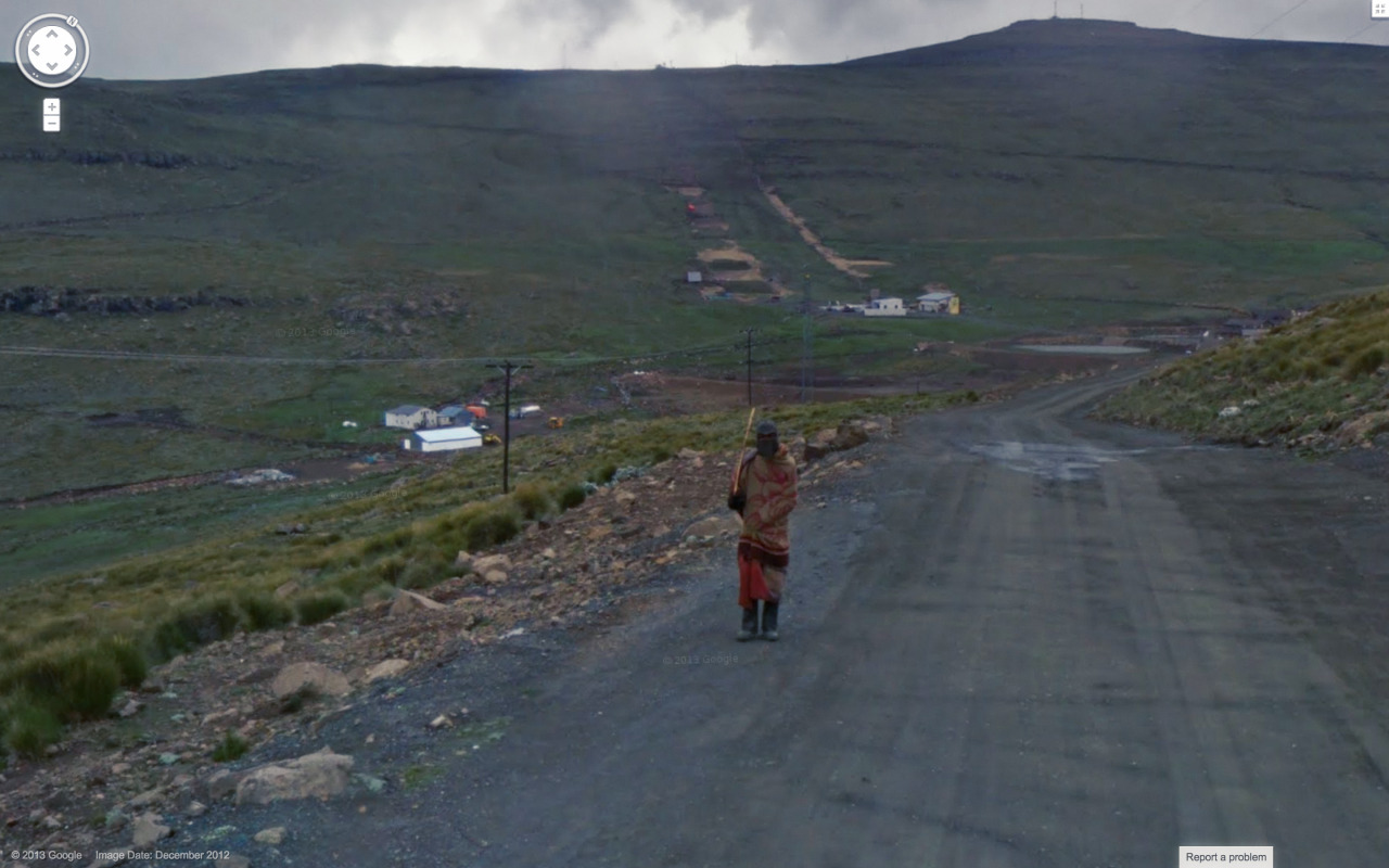
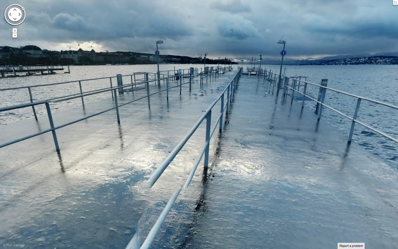
On another note, South's article featured photographs from of the artist Jon Rafman, which he collects through the use of Google Street View. I felt that his images captured the idea of the internet as a tool for providing information and a way to communicate by showing interesting scenes from what seems to be all over the world, and collected by use of the internet. Some images were a bit strange, some are really beautiful, and some of them are slightly sinister. It's an interesting way to capture all aspects of the web.


This cynicism was balanced out by the fact that the internet has definitely come very far from its initial development- it's gone beyond the initial goal of creating a new form of communication that would provide immense amounts of information in almost no time at all. In addition to communication, the internet is a way to create art and form identities for ourselves in completely new ways. It's therefore important to continue developing the technology we use, and discover new ways to use it. The closing message certainly has its significance, and I definitely think that there are new ways of creating messages or artwork that have yet to be discovered. But I also think there are those people (myself often included) who will use that same amazing technology to fool around on Facebook or look at pictures of fuzzy animals.
On another note, South's article featured photographs from of the artist Jon Rafman, which he collects through the use of Google Street View. I felt that his images captured the idea of the internet as a tool for providing information and a way to communicate by showing interesting scenes from what seems to be all over the world, and collected by use of the internet. Some images were a bit strange, some are really beautiful, and some of them are slightly sinister. It's an interesting way to capture all aspects of the web.
Wednesday, March 26, 2014
Project 2- Vector Drawing
My second project! The idea I had for this project changed quite a bit from my last progress post. I decided to play with size, and based the final image off of the scene in "My Neighbor Totoro", when the girls and Totoro are standing in the rain by the bus stop sign. Not sure how well that idea got across, but it ended up being pretty fun anyway. Edit from the last time this was posted- I decided to keep the messy edges that I had when I was working on this.
 |
| "My Neighbor Steve" |
Monday, March 24, 2014
Logo remix- Gundam Wing
Gundam Wing was one of my favorite shows as a kid because it featured guys in giant robots blowing things up. The premise was actually way more complicated than that, but the giant fighting robots were really all that mattered to me. Anyway, I thought it would be fun to remix its logo for this assignment. Here's the original:
I really wanted to feature a silhouette of Wing Zero (look it up), and the rest came together after that. I wanted to use a similar font, but have the text non-italicized to match the straight-on view of silhouette. I don't think it really loses the dramatic cheesiness of the original, but I guess if I did that then I wouldn't be properly representing the show.

| In all its 80s/90s glory |
I really wanted to feature a silhouette of Wing Zero (look it up), and the rest came together after that. I wanted to use a similar font, but have the text non-italicized to match the straight-on view of silhouette. I don't think it really loses the dramatic cheesiness of the original, but I guess if I did that then I wouldn't be properly representing the show.
Thursday, March 13, 2014
Portrait progress and AI tool post
My progress thus far on my portrait piece:
 It's eventually going to be more than Steve's giant nose- I think I'm going to have him standing on something that trails down the canvas (hence the huge white space). We'll see how the rest of it turns out!
There are a few tools in Illustrator that I have yet to use. One of them is the gradient tool, which allow you to control value scales within your work. It's pretty neat, but I've never used it much in Photoshop so I don't know if I'll end up doing much with it in Illustrator. Anyway, you can learn more about it here.
There are a few tools in Illustrator that I have yet to use. One of them is the gradient tool, which allow you to control value scales within your work. It's pretty neat, but I've never used it much in Photoshop so I don't know if I'll end up doing much with it in Illustrator. Anyway, you can learn more about it here.
Monday, March 10, 2014
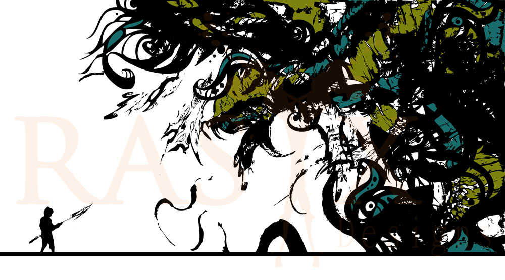
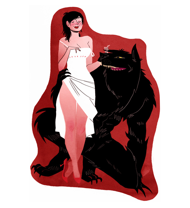
Vector artist post: RasixDesigns
Raul Seng Iglesias is an artist and musician from Mexico. In addition to his vector work, he also does photography, traditional animation and illustration, and editorial design. There is unfortunately little on his background and how he got started, but his work can be seen in a variety of places and websites. He's done some really neat album art for different bands, some of which he's played guitar or bass for.
His illustrations all have a very whimsical feel to them, which he accomplishes with various styles. Much of his work involves stark use of color, and intricate detail through the shapes making up the final image.
A few of his works also seem to have a more painterly quality. In all of his work, the composition and use of space seem to be very well thought out in order to balance out the impressive amount of detail he puts into his work.
Both of Raul's styles show the wide range of experience he has as a digital and traditional artist. It's a shame that there is so little on his process and how he works- having studied some of the tools of vector artwork in class, I have to wonder if he spends hours and hours just making small shapes with the pen tool, or tiny brush strokes with the blob brush. The idea of that is a little mind-numbing, but at least his work is pretty.
 |
| "There's Something Dead in Here" Album art for Jacket Bullet |
 |
| "2.0" |
 |
| "Wolf" |
 |
| "Chasing my Nightmare" |
Music Sketch assignment

For this assignment we needed to make an abstract sketch while listening to a song that was played in class. It was an interesting assignment, but a little out of my comfort zone. When I was listening to the music I thought of ripples in water, so I made some circles from the preset shape tools. From there I imagined twisting the shapes and using different colors.
Thursday, March 6, 2014
Project 1- "When the Shadows Get Long"
A long-belated post on my first major project! The assignment was to combine an image from the web, a photograph, and a scanned image. I made the background from a photograph I took during a family vacation to Yellowstone, and a sunset image from the web. I then made pools of water from CD scans. Finally, I added a figure I drew and made it all ghost-like by reducing the opacity. It was a lot of fun to make.
 |
| "Well, they call me William the Pleaser I sold opium, fireworks, and lead Now I'm telling my troubles to strangers And when the shadows get long I'll be dead." -Tom Waits, "Lucinda" |
Special thanks goes to my laptop, which somehow didn't spontaneously combust while I was working on this massive file.
Thursday, February 27, 2014


Monday, February 24, 2014
Artist post- Pascal Dombis
Pascal Dombis is a digital artist living and working in Paris. He first received a degree in Engineering from Insa University in Lyon, and later became interested in using computers for producing artwork while taking a digital art class at Boston Museum School. His work is famous for reproducing simple patterns using computers and algorithms, and inputting these patterns until new and unpredictable forms emerge.
Through his process and the actual images he produces, Dombis tries to create a paradox between chaos and order. Although the pattern and the rule he applies to it may be simple at the beginning, repeating it to excess results in new images that can't be predicted by the programs he uses. This is supposed to be representational of the chaos and order that coexist in today's world.
 |
| "Artisana II" (2000-2008) |
 |
| "Right Rong" (2011) |
While the message behind his work is a little high for me, I do think Dombis achieves his idea of creating something new from simple patterns and rules. A lot of his work has a symmetry to it that hints at the rules and algorithms governing his process, but at the same time the images have an energy to them that I wouldn't expect from something that is based so heavily in algorithms, math, and logic. It's an interesting application of something I wouldn't first think of crossing over with the art world.
Saturday, February 22, 2014
Art Event #1- Gabiela Bulisova's "Time Zone"
Gabriela Bulisova is a documentary photographer and multimedia artist from Washington, DC. Her work examines individuals who are underrepresented around the world and in the US. On February 20th, she visited St. Mary's to present her film "Time Zone", which was a collaborative piece made with Lashonia Etheridge-Bey. Lashonia, raised in one of the most violent parts of DC, was imprisoned for half of her life for a double murder. After being paroled December 2011, she and Gabriela worked together on "Time Zone" to document her and her family's struggles while she tried to reenter society.


Gabriela became interested in the justice system and prison after being asked to explore the topic of "war". Having often seen the issue through a universal viewpoint, she decided to look at it on a more individual level. Seeing individuals trying to reenter society after incarceration then inspired her to document these people's struggles. Before presenting her film, she addressed the many challenges a person recently released has to face- their family may have been living years without that individual present, their home and possessions may have been taken away, and their chances of employment are minimal at best with their criminal record. With all of these odds stacked against them, the individual is at a constant "war" trying to reestablish their place in society without returning to crime.
The movie following Lashonia presented an in-depth understanding of her struggles, and the tensions still present in her family after her imprisonment. I found Lashonia herself to also be very insightful and open about her own situation- she addressed what led to her committing her crime, although the factors of family life and environment were no excuse for her actions. She additionally said that the current system may be flawed, but individuals who have committed crimes still need some form of punishment. Gabriela clearly made a careful decision in picking her subjects for her photographs and documentaries- the stories she focuses on defy the typical stereotypes of people who have been imprisoned. The viewer is then forced to examine the people in her work as human beings, and not simply as criminals.
Gabriela's photographs from "Time Zone" and her other work can be seen on her website.
Monday, February 10, 2014
Artist post- Emily Carroll
Emily Carroll studied animation at Sheridan College. After she graduated, she moved to Vancouver, British Columbia to work in the television animation industry. She maintains several different online galleries to showcase work inspired by video games, books, and fashion. She additionally has her own website, which has her original comics and miscellaneous illustrations.


 |
| From "Gaming Flickr Set" |
 |
| "My Horns Shimmer Red" Comic |
I first fell in love with her comics, which she uses to tell all sorts of stories. A few of them are strange and disjointed dream journals. Others, like Anu-Anulan and Yir's Daughter have a folktale or mythological feel to them. A good deal of them are also pretty macabre- Out of Skin ranks as one of my favorites, but can also give me a good case of the willies.
 |
| Panel from "Out of Skin" |
This aside, I think her comics are fantastic. She has a very distinct style, and the stories she tells are compelling (despite being a bit scary). Additionally, many of her comics are also done in a way that they can only be fully enjoyed by looking at them on the web. "The Three Snake Leaves" and "Margot's Room" involve pointing and clicking different parts of the comic to progress through the story. In "The Prince and the Sea", Carroll takes advantage of having to scroll through a web-page by using color to guide the viewer's eye through the page.
The digital techniques she uses in her work are not very complicated, but I think Carroll uses them in combination with her artistic skill and storytelling very expertly. The changing panels and the interactive nature of her comics add to the stories without being overdone. They make her comics webcomics, instead of just being comics you can find on the web.
 |
| The interactive first panel of "Margot's Room" |
Thursday, February 6, 2014
Color Correction
In-class activity on color corrections.
First we worked on a picture of a mushroom:
 |
| Mushroom before |
 |
| Mushroom after |
And then we did a chicken.
 |
| Chicken before |
 |
| Chicken after |
Later, I did my own touch-up on a random old photograph I found on the internet*. Here is the original:

And here is the edited version:

*I just googled "old photos". This was after googling "weird photos" and "bad photos". Don't ever do this; you stumble upon some scary things.
Wednesday, February 5, 2014
Collage project- "Tulip"
Following the experimental scan project, I needed to make a collage using a bunch of different scans. I thought I would make something based off of this song- I immediately thought of it when I saw the image I used to make the hair. Everything (eventually) came together after that. The original photoshop file probably has a bajillion layers because of all the cutting and pasting I did. After that, I did some additions with the brush tool to refine things a bit.
I'm not sure how well this actually fits the song. Apart from the fact that there are no actual tulips used in the image, I was told the woman looks more contemplative than drowned... but it was still fun to do.

I'm not sure how well this actually fits the song. Apart from the fact that there are no actual tulips used in the image, I was told the woman looks more contemplative than drowned... but it was still fun to do.
Sunday, February 2, 2014
Experimental Scans
For this assignment, I had to find unique ways to use a scanner. I started by grabbing a bunch of shiny objects around my apartment, and then tried to move them around while they were being scanned.
 |
| Bracelet |
 |
| CD |
 |
| CD again |
 |
| Dragon pendant |
 |
| My glasses... and my hand |
 |
| Compact mirror cover and a bit of my fingers |
 |
| Compact mirror |
 |
| Scarf |
 |
| Necklace |
 |
| Scarf, moved differently over the scanner |
Subscribe to:
Posts (Atom)